Kaiser Permanente Chat Bot
Project Overview
Rethinking digital health conversations
Given the medical climate of 2022, there was a push to constantly update the Kaiser Permanente website for the latest information of variants, outbreaks, medical advice, and travel guidelines. Along with these updates, we needed to unify the experience across the KP brand and digital platforms with low chat bot engagement and limited ability to resolve member questions effectively.
A mobile-app-first approach was used to develop a more empathetic, contextually aware chatbot. The project spanned from discovery research through multiple design iterations to a final validated prototype ready for development.
The new experience leveraged modern AI capabilities to deliver faster, more accurate responses while maintaining the human touch that healthcare demands. The result was a significantly improved user experience that balanced technology with empathy. Multiple products including the chat feature were redesigned and updated along with other enterprise products were explored including augmented and virtual reality, medical video chats, and even what healthcare was in the metaverse.

Project Highlights
Product Growth
Grew chat bot engagement with customers by 23%

For the Customer
Improved overall customer satisfaction by 18%
Enhanced AI
Explored & implemented deeper AI platform capabilities
😡 🤬
Pain Points
Our customers were experiencing 3 primary issues within the KP brand experience.
1. Outdated UI - The messaging system needed to be upgraded so it felt updated and visually appealing.
2. Experience - Our customers felt frustrations with the experience such as coming across dead ends in the chat.
3. The Bot - The AI which drove the company bot needed to give our customers more options to self-serve their questions.
Project Discovery
🖊️ 🖋️
Design Direction
The design team wanted to make the improved redesign quick, simple, and intuitive. User research and data presented the team with solid design direction.
The team knew where the primary pain points were and areas to provide a more delightful experience from start to finish. The new platform provided more design flexibility as well as better micro interactions for KP touches throughout the experience.
😎 🧐
Team Makeup
3 UX Designers
1 Content Designer
1 UX Researcher
2 Developers
Partners
Business | Strategy | Mobile
Digital Equality

Ryan
Male | 26 years old
Digital Touch Points
Smartphone | Instagram | LinkedIn

Hilda
Female | 67 years old
Digital Touch Points
Desktop | eMail | Facebook
Where designs meets technology
The core pillars drove the chatbot redesign on a world-class platform and genuinely intelligent AI capabilities.
Platform
The team needed to take our chat bot experience from the Genesys platform to the Adobe Experience Manager platform.
This gave the design team as well as business strategy more flexibility to give our customers better experiences. This way the first phase of the project was executed before the design team was able to explore other improvements.
KP Touches
We were aware of the health spectrum our members experienced. These areas presented opportunity the design team took advantage of to give our customers the ability to accurately describe their state of health and emotions.
From temporary disabilities to those that are permanent, we thrive to design for digital equality and accessibility at every touch point of the KP experience. Designing by keeping people at opposite ends of the digital experience spectrum, we make our enhance our products for everyone in between.
Improved A.I.
The bot and A.I. weren’t robust enough to answer some customers' questions under the L.U.I.S. A.I. platform.
The platform needed to be trained further to have the ability to answer more comprehensive queries from our customers. This led to new workflows the design team explored in order for the AI to handle properly.
Design Iterations
As with any good design, the team explored several designs and iterations before shipping the first phase of the product. With more features and enhanced experiences planned in our product roadmap, the initial launch would give KP data and information that will guide future releases.
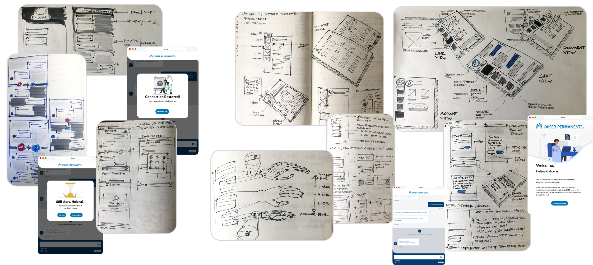
Entirely different UIs were explored that would lead to an improved experience
While thinking of short term releases, those design would guide features years down the road.
Deeper into the product roadmap, the team was able to explore widget designs
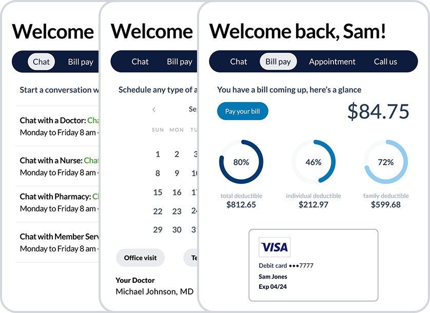
Design Launch
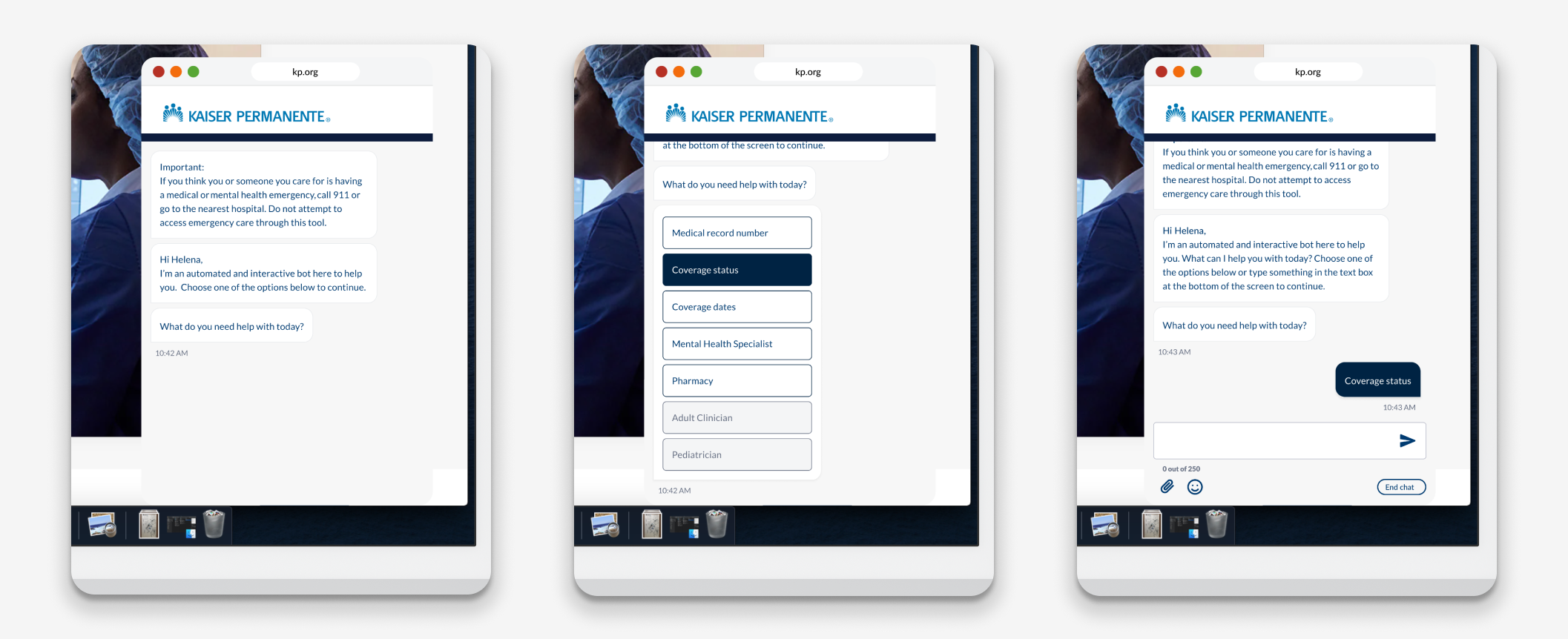
Options and flow
The desktop experience gave users plenty of visibility and space to clearly articulate the flow of conversation guiding them in their next steps. We presented the users with more options to improve the chances of a successful interaction and better experience.
Omni channel experiences were paramount by giving the users the ability to switch from device to device. Transferring their journey from computer to computer and onto their mobile device. Limiting the users and their access to care was an obstacle we had to eliminate.
The designs shown were launched to our customers and for the public. With this only being the initial launch, the design team was excited to explore more options and improve the experience even further with each version.
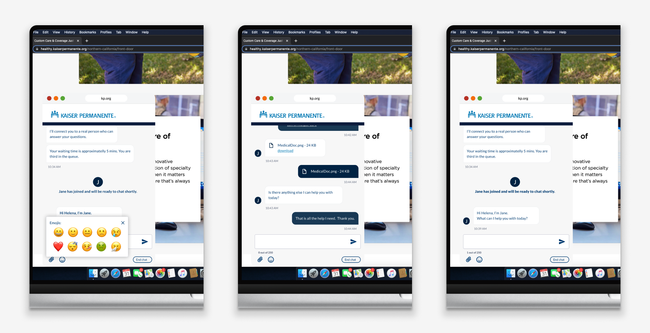
Device to Device
The future of healthcare
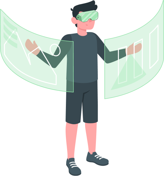
Metaverse
Extending the product roadmap even further down the road, our team was able to take our imagination into the metaverse.
AR / VR
The prospect of bringing augmented and virtual reality into the KP brand was exciting for all involved.
Widget
A KP widget is in the early stages of design and the team of designers had a clean slate to work with. The team wanted to bring the most impactful and valuable action items front and center at the users fingertips.